

 Login
Login
 September 7, 2016
|
Voiced by Amazon Polly |
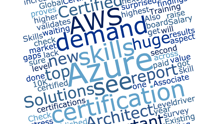
We recently had Global Knowledge 2016 IT Skills and Salary Report published.
This report proves that with fast moving technology landscape, trainings are becoming more important than ever before. Training remains one of the most important aspect of global workforce, especially when reports like Zinnov’s prediction that 25% of global IT workforce will become redundant in few years. Below are some of the important findings of the report.
- Existing skill gaps increase stress on employees
- Cybersecurity, cloud computing and networking skills are in demand
- Building new skills is the top driver for professional development
- 21% of the responders got raise greater than 11% because they “Developed new skills that were of added value“
- AWS Certified Solutions Architect – Associate is the second highest paid certification. What are you waiting for to get certified?
- I am surprised to NOT see any Azure certifications in top 20. We see huge demand, and I am sure Azure 70-534, Azure 70-533, Azure 70-473 Certifications will be there next year. These certifications are hard, and my guess is there are not enough participants with these certifications, so they are missing from the list.
- Out of more than 10K people who were surveyed, only 35 were AWS Solutions Architect – Professional Level Certified. We see a huge demand for this level of certification too across the board. So this validates the lack of this certification in the market.
Also, check out the below infographics published by AWS from the report.
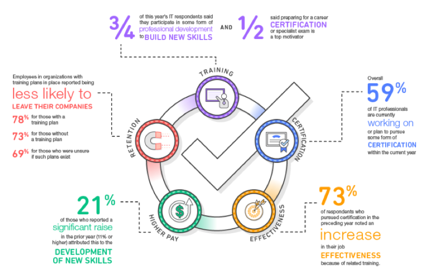
Source: aws.amazon.com
Upskill Your Teams with Enterprise-Ready Tech Training Programs
- Team-wide Customizable Programs
- Measurable Business Outcomes
About CloudThat

WRITTEN BY Bhavesh Goswami
Bhavesh Goswami is the Founder & CEO of CloudThat Technologies. He is a leading expert in the Cloud Computing space with over a decade of experience. He was in the initial development team of Amazon Simple Storage Service (S3) at Amazon Web Services (AWS) in Seattle. and has been working in the Cloud Computing and Big Data fields for over 12 years now. He is a public speaker and has been the Keynote Speaker at the ‘International Conference on Computer Communication and Informatics’. He also has authored numerous research papers and patents in various fields.


Comments