

 Login
Login

 September 23, 2025
|
Voiced by Amazon Polly |
Overview
The ability to quickly visualize and understand massive datasets is paramount in big data. However, this has traditionally been a cumbersome process in the Apache Spark ecosystem. Before the advent of PySpark Native Plotting, data analysts and data scientists had to navigate a significant hurdle: moving data from the distributed Spark environment to a single-node plotting library like Matplotlib or Seaborn. This was typically done by converting a PySpark DataFrame to a Pandas DataFrame using the toPandas() method. While this approach worked for smaller datasets, it was a major bottleneck for large-scale data, often leading to out-of-memory errors and severely slowing down the analysis workflow. The introduction of PySpark Native Plotting, a recent and transformative feature, addresses this challenge head-on. Enabling direct visualization from PySpark DataFrames allows for a seamless, efficient, and scalable approach to data exploration, fundamentally changing how we work with big data.
Pioneers in Cloud Consulting & Migration Services
- Reduced infrastructural costs
- Accelerated application deployment
Introduction
PySpark Native Plotting is a groundbreaking feature that integrates robust visualization capabilities directly into the PySpark ecosystem.
The feature is built on top of pyspark.pandas API provides a familiar interface for users already comfortable with the Pandas library and uses Plotly as its default backend for creating high-quality, interactive visualizations. This allows users to leverage the power of distributed computing for data processing while enjoying a rich, interactive plotting experience, all within the same environment.
Internals
The true magic of PySpark Native Plotting lies in its intelligent handling of data, which is at the core of the Spark framework. Instead of collecting all the data onto the driver node for plotting, which would defeat the purpose of distributed computing, it uses three distinct and smart strategies to generate visualizations efficiently.
Strategy 1: Top N Rows
For certain types of plots, such as bar plots and pie charts, where a limited number of categories or values are typically sufficient to represent the data, PySpark employs the “Top N Rows” strategy. To generate the plot, the system intelligently fetches a specified number of rows (e.g., the top 1000, which is a configurable default). This approach is highly efficient because it minimizes the data transfer from the distributed partitions to the driver, allowing for quick insights and a responsive user experience. It’s perfect for a quick overview of a categorical variable or a top-performing list.
Strategy 2: Sampling
When dealing with plots representing distributions or relationships across a large range of data points, such as line plots and scatter plots, the “Sampling” strategy comes into play. PySpark takes a random sample of the data from the DataFrame. This method is effective because a well-distributed sample can accurately represent the overall data pattern without requiring the processing of the entire dataset. This ensures that even with billions of rows, you can generate a scatter plot to identify trends or a line plot to show a time-series trend in seconds without overwhelming the driver’s memory.
Strategy 3: Global Metrics
For statistical plots that require a comprehensive view of the entire dataset to be accurate, like histograms and box plots, PySpark uses the “Global Metrics” strategy. In this case, the necessary summary statistics (e.g., bin counts for a histogram, or quartiles for a box plot) are distributed across all partitions. The results of these distributed calculations are then aggregated on the driver node and used to generate the final plot. This ensures statistical correctness and a true representation of the data’s distribution, making the plots reliable for deep analytical insights.
Using these strategies, PySpark Native Plotting successfully bypasses the limitations of the old workflow. The data never needs to be fully collected on a single machine, which prevents memory issues and ensures that the plotting process remains fast and scalable, regardless of the size of the dataset.
Example
Let’s illustrate how simple it is to use PySpark Native Plotting with a hypothetical dataset of product sales. First, we’ll create a sample PySpark DataFrame.
Code:

Example:
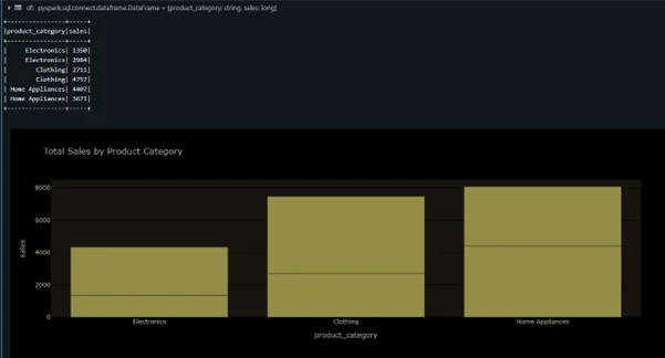
The code is clean, intuitive, and remarkably similar to the Pandas plotting API, which makes the transition for data professionals seamless. The plot property on the DataFrame is the entry point, and from there, you can call various plot methods like bar(), line(), or scatter(). The result is a crisp, interactive plot generated on the fly.
Features and Supported Plot Types
PySpark Native Plotting is not just about a single-function fix; it’s a comprehensive feature with various capabilities. Key features include:
- Familiar API: The plotting interface is designed to be consistent with the widely-used Pandas plotting API, shortening the learning curve.
- Interactive Plots: Using Plotly as the backend ensures that all plots are interactive, allowing for zooming, panning, and hovering to view specific data points.
- Scalability: The core strength of the feature is its ability to handle big data by avoiding the collection of the entire dataset on a single machine.
- Performance: Using smart data-handling strategies, plots are generated significantly faster than the traditional toPandas() approach on large datasets.
The feature supports a wide range of common plot types, making it versatile for most data exploration tasks:
- Line plots: Ideal for visualizing trends over time or continuous variables.
- Bar plots: Perfect for comparing categorical data.
- Area plots: Useful for showing how parts of a whole change over time.
- Scatter plots: Excellent for identifying correlations or patterns between two variables.
- Pie charts: Best for displaying the proportional composition of a whole.
- Box plots: Great for visualizing the distribution of a variable and identifying outliers.
- Histograms: Used to show the frequency distribution of a continuous variable.
- Density/KDE plots: Provides a smooth, continuous estimate of the probability density of a variable.
Conclusion
PySpark Native Plotting marks a significant milestone in the evolution of big data analytics. It bridges the long-standing gap between distributed data processing and single-node data visualization, creating a powerful, end-to-end workflow for data professionals. By providing a native, scalable, and memory-efficient way to create interactive plots directly from PySpark DataFrames, it removes a major pain point. It unlocks new possibilities for large-scale data exploration. The familiar API and the robust backend make it an indispensable tool for anyone working with big data. As this feature matures, it will undoubtedly become a cornerstone of the modern data science and engineering toolkit, empowering users to move from raw data to actionable insights faster and more effectively.
Drop a query if you have any questions regarding PySpark Native Plotting and we will get back to you quickly.
Empowering organizations to become ‘data driven’ enterprises with our Cloud experts.
- Reduced infrastructure costs
- Timely data-driven decisions
About CloudThat
FAQs
1. Is PySpark Native Plotting replacing traditional plotting libraries like Matplotlib or Seaborn?
ANS: – PySpark Native Plotting is not meant to replace traditional libraries entirely but rather to complement them, especially for the initial stages of large-scale data exploration.
2. What do I need to install to use PySpark Native Plotting?
ANS: – To use PySpark Native Plotting, you must install Apache Spark and PySpark. Additionally, the plotting functionality relies on pyspark.pandas API.

WRITTEN BY Yaswanth Tippa
Yaswanth is a Data Engineer with over 4 years of experience in building scalable data pipelines, managing Azure and Databricks platforms, and leading data governance initiatives. He specializes in designing and optimizing enterprise analytics solutions, drawing on his experience supporting multiple clients across diverse industries. Passionate about knowledge sharing, Yaswanth writes about real-world challenges, architectural best practices, and lessons learned from delivering robust, data-driven products at scale.


Comments